Monday, April 18, 2011

Correlation Matrix

A correlation matrix is a matrix that gives correlations between sets of data.  This particular matrix is showing the correlation of t7 proteins.  These ranges can been seen from high (red) to low (blue). 

http://yin.che.wisc.edu/images.htm

Nominal Area Choropleth Map

Nominal Area Choropleth Map is a map that is used to display nominal data.  These types of maps usually show differences in numbers. This particular map is showing the different numbers in electoral votes in each state during the 2000 election.

http://www.sptimes.com/election2000/map.shtml

DOQQ

DOQQ or Digital Orthophoto Quarter Quads are digital aerial photos that are produced by the USGS.
Many of the DOQQ maps will generally contain color infrared technology. 
This particular DOQQ is showing coastal Louisiana, highlighting the oceanic boundaries using a 1:100,000 grid.

http://www.lacoast.gov/maps/2004doqq/

Sunday, April 17, 2011

Similarity Matrix

A Similarity Matrix is a type of graph comprised of multiple squares that create the matrix. These squares are aligned in a sequence. Scores with larger numbers are assigned to characters which are very similar. Characters that are dissimilar are assigned negative numbers. The overall goal of this matrix is to express similarity between two different data points which are being observed. 
The Similarity Matrix that is displayed shows the similarity of phenotypes for 10 bacterial strains. There are nine different boxes, each with a different design. Each box represents the percentage of similarity between any two strands. As you can tell, the boxes that are completely black show those strands that are the same, or 100% alike.


Coninuously Variable Proportional Circle Map

A Continuously Variable Proportional Circle map is a type of map in which circles of many different sizes and colors represent some set of data. In most cases the cartographer will use larger circles to represent the largest set of data being observed. A larger circle tends to represent a larger data value. Population size is not the only thing that can be inferred from a look at these maps - the continuously variable maps also use different colors within each circle to represent some set of information even further than just population size. These maps are very useful in situations where a cartographer wishes to show information such as major industries within a certain population of a country, etc. 
In the Continuously Variable Proportional Circle map shown, the major industries of Germany are shown. It is clear that in the most heavily populated area, iron and steel and machinery and metal working are the most common industries. 


Range Graded Proportional Circle Map


A Range Graded Proportional Circle map is a type of map in which circles of many different sizes are used to represent some value of data. The cartographer decides which size of circle will represent what values of data being studied. Typically the larger the circle, the larger the value of data being observed. One of the main reasons these maps are used is because they allow for symbol size discrimination, not only magnitude estimation. 
The map displayed shows the 1990 population distribution in Africa. The largest of the circles represents most heavily populated areas. It is clear from this map that Nigeria is the most heavily populated area.

http://www.d.umn.edu/geog/cartfolder/HTML%20Pages/Map-Types.htm

Unclassed Choropleth Mp


An Unclassed Choropleth Map was designed to avoid the problem that most other thematic maps seem to cause - fixing class limits. The Unclassed Choropleth map instead uses a continuous-tone scheme. Every region on this map has its own specific color that represents its value. The only exception to this would be due to there being extreme outliers - these values would fall into one of two classes on either side of the value range. If there is a very important threshold, there can be two separate color transitions to set class boundaries. In Unclassed Choropleth maps, the numeric value is converted directly into a proportional degree of darkness. The higher the object's value, the darker the shade of representation will be. 
The shown diagram displays the fertility rate attribute values for countries in Europe. The maximum fertility rate would be 2.27 children per woman in Albania and it is represented by the darkest shade. The minimum rate of fertility is 1.13 children, in Bulgaria and is represented by the lightest shade.

Star Plot

A Star Plot is a type of map that allows its viewer to quickly compare the relative behavior of multiple variables in a given set of data. A Star Plot is comprised of multiple equi-angular spokes, called "radii". Each radii is responsible for representing a unique variable in a set of data.
This particular Star Plot displays 16 types of vehicles, and compares nine different qualities such as price, gas mileage, trunk space, etc. This Star Plot makes it relatively easy to draw multiple conclusions about each vehicle. For example, a quick glance at the Cadillac Seville's graph will tell you that it is one of the most expensive vehicles, it has an average repair record and below average gas mileage.

DEM

A Digital Elevation Model is a type of map that is used to represent only the height information of surfaces. This map completely abandons any further information about the terrain. There are many uses for a Digital Elevation Maps. Models representing water flow, terrain analysis, line-of-sight analysis, base mapping and precision farming and forestry are just a few examples of these uses.
This particular Digital Elevation Model displays the Japanese city of Isehara, Kanagawa Prefecture and its surrounding areas. This map, like many DEM maps puts more emphasis on the vertical scale than the horizontal scale to enhance the differences in the terrain's height.

Bivariate Choropleth Map

A Bivariate Choropleth map is a map that uses a single map to display two variables by combining two different symbol or number sets. This map displays two sets of events simultaneously. The main objective of a bivariate map is to find a simple method for accurately and graphically illustrating the relationship between two spatially distributed variables. 
The map shown compares small multiple maps f cancer rates and amounts of health insurance. Use of the multiple technique will allow the maps viewer to break down the population even further, by race and type of cancer.


Classed Choropleth Map

A Classed  Chorolpleth Map is a type of thematic map that utilizes color shadings to differentiate among a certain class attribute value. This map type portrays data that shows the distribution of males per every 100 females throughout the United States.The state of Nevada actually has more males than females according to this graph.

http://my.ilstu.edu/~jrcarter/Geo204/Choro/

Univariate Choropleth Map


A Univariate Choropleth Map is a map that uses colors to differentiate among data. This map uses only one data type. 
The map displayed shows a statewide estimated household income. This graph is highly useful in emphasizing demographic patterns and other differences.


Standardized Choropleth Map

A Standardized Chorolpleth map is a map that uses colors to differentiate among different percentages of numerical data. The data in this graph tends to be averaged or a percentage, not a raw number. 
The map shown displays the percentage of population that is below the age of 14 years old in 2006 in Canada.


Unstandardized Choropleth Map


A Nominal Area Chorolpleth Map is a thematic map that is used to describe something about a predefined areal unit. By the use of different colors, it is easy for the maps viewer to make inferences about the map by simply looking at a color of a certain area on the map. Each different color on the map represents a different quartile. These maps use numbers which are raw, and have not been averaged.
The map shown displays how much money a certain school district spends on each child in it's school system. The darkest-shaded counties are those which have spent the greatest amount of money on their students, while the lightest-colord counties have not spent as much money on theirs. 

Bilateral Graph

A Bilateral Graph is a graph that depicts two situations that occur over the same period of time. The lines that show the movement of the situations usually act in opposite directions. 
The graph depicted shows that the percentage of longer-term mortgage assets decreases while construction and development loans are increased. They were farthest apart in 2003, and were the same sometime in the middle of 2005.
http://www.fdic.gov/regulations/examinations/supervisory/insights/siwin09/Interest_Rate_Risk.html

Lorenz Curve


A Lorenz Curve is used mostly in economics and is used to display the inequality of wealth. The curve s a function of the cumulative proportion of ordered individuals mapped onto the corresponding cumulative proportion of their size. The points on the graph always start at (0,0), and end at (1,1). 
This Lorenz curve illustrates the degree of inequality in the distribution of income.

http://www.unc.edu/depts/econ/byrns_web/Economicae/Figures/Lorenz.htm

Index Value Plot

An Index Value Plot is a graphical representation that is used to display that frequency with which a certain event either increases or decreases. These plots are used a lot by those who are following a certain stock or weather patterns. 
The graph displayed shows movement of the Russell 1000 Value along with the Russell 2000 growth ratio. A quick look at the graph shows the reader that the values reached extremes of 1.00 and .82, while the vast majority of the movement occurred somewhere in-between these two numbers. 


Scatterplot

A Scatterplot is a diagram that displays two variables of data by using two Cartesian coordinates. The patters on the graph are scattered, having one position (dependent variable) being determined by that of the other (independent variable). 
The diagram used displays the relationship between the height and weight of 606 Afghani children between the ages of 6-14 years old. 


Population Profile

A Population Profile is a chart used to display the number of people in a given region, differentiated by their age groups.
The graph used represents the growth curve for Moblie County in 1998.  The age is on the y-axis and is listed in increments of 4 years. The percentage of each age class relative to the total population is listed on the x-axis. 

Climograph

A Climograph is a graph used to display the information about a certain locations temperature in fahrenheit, and its precipitation in inches during each month, generally over the period of a year.
According to the graph, the coldest months are January and December, while the hottest month is July.

Windrose

A Windrose map is used to display the orientation of it's viewer in correlation to the four cardinal directions - north, east, south and west. The compass is comprised of 32 points (wind directions). Of these 32 wind directions, eight were named - Counterclockwise: Tramontana, Gregale (NE), Levanter (E), Sirocco (SE), Ostro (S), Libeccio (SW), Poniente (W), and Mistral (NW). 

Triangle Plot

A triangle plot is a graph of 3 variables and is most often used in geologic studies.  These studies can be used with a variable of system variables.  This particular triangle plot is showing the relation compositions of soils and rocks. 

http://www.dplot.com/triangle-plot.htm

Parallel Coordinate Graph

A Parallel Coordinate Graph displays data with more than 2 dimensions. Each attribute is displayed as a vertical line, ranging from the lowest value of that attribute to the highest. It provides a relatively simple and quick way to view performance of multiple objects in relation to each other.
The example used portrays certain statistics of nine different baseball players. By observing this map it is clear that Ben Zobrist is the most reliable fielder out of the nine ball players, while Adam Dunn is clearly the worst.

Histogram

A Histogram is a graph created by Karl Pearson, which is used to show a distribution of data. It uses adjacent rectangles to show the frequencies of a certain occurrence compared to some other piece of information. The height of each rectangle in a histogram represents the frequency of occurrence. The total area of a histogram is equal to the number of data observed.
The graph shown displays the distribution of grades of students in a certain class. The majority of students (about 40) received a grade lying somewhere between 60% and 80%.  Approximately 3-4 students received a grade somewhere between a 0 or a 20% out of a possible 100%.

Box Plot


A Box Plot is a method that was created in order to display a five-number data summary. Another common name for this graph is a "box & whisker plot". Within the box plot is the median, the upper and lower quartiles and the minimum  and maximum data values. Within the actual box itself lies the middle 50% of the data. The upper edge of the box contains the 75th percentile of the data, and the lower edge contains the 25th percentile of the data. The line within the box displays the median value. The very end lines show the minimum and maximum data values.
The Box Plot shown represents the distribution of salaries of employees of a certain company. From looking it is clear that the salary range is very large. The highest earner earns around $97,000, while the bottom earner brings in about $14,000. The majority of employees earns a salary closer to the lower end of this range, with 50% of employees earning somewhere between $25,000 and $65,000.

Stem and Leaf Plot


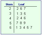
A Stem & Leaf Plot is a map used in statistics that presents quantitative data in a graphical format. This graph comes from Arthur Bowley, and is used a lot in exploratory data analysis. The most basic stemplot is created from two columns separated by a single vertical line. The "stems" are located on the left and the "leaves" on the right. These graphs quickly show the viewer the ranges of distribution of numerical data. The leaf represents the "ones" place, while the stem represents the rest of the number.
The Stem & Leaf Plot used in this example displays the number of students enrolled in a certain class over the past 12 years. The numbers are 81, 84, 85, 86, 93, 94, 97, 100, 102, 103, 110 & 111. It is clear to see from a quick glance at the map that the most common class size was somewhere in the 80's, and the classes containing 110 or more students was the least frequent.

DLG

A DLG stands for a Digital Line Graph which are digital representations of topographic maps.  There are four primary layers of a DLG; boundaries, transportation, surface waters, and contours.  This a particular DLG maps of South Carolina.
http://www.dnr.sc.gov/GIS/descdlg.html

DRG

A DRG (Digital Raster Graphic) map is a scanned image of a topographic map. DRG's can be useful in assessing the completeness of data from other mapping agencies.  This particular DRG of Western Washington D.C.
http://egsc.usgs.gov/isb/pubs/factsheets/fs08801.html

Tuesday, April 12, 2011

Isopleth

Isopleth maps use contour lines to join points of equal value across many variations.  This Isopleth map in particular is showing the PH levels and how sensitive each region is.  By looking at the legend, the dark blue areas are showing where extreme sensitivity took place.
http://www.globalchange.umich.edu/globalchange1/current/lectures/kling/water_nitro/water_and_nitrogen_cycles.htm